
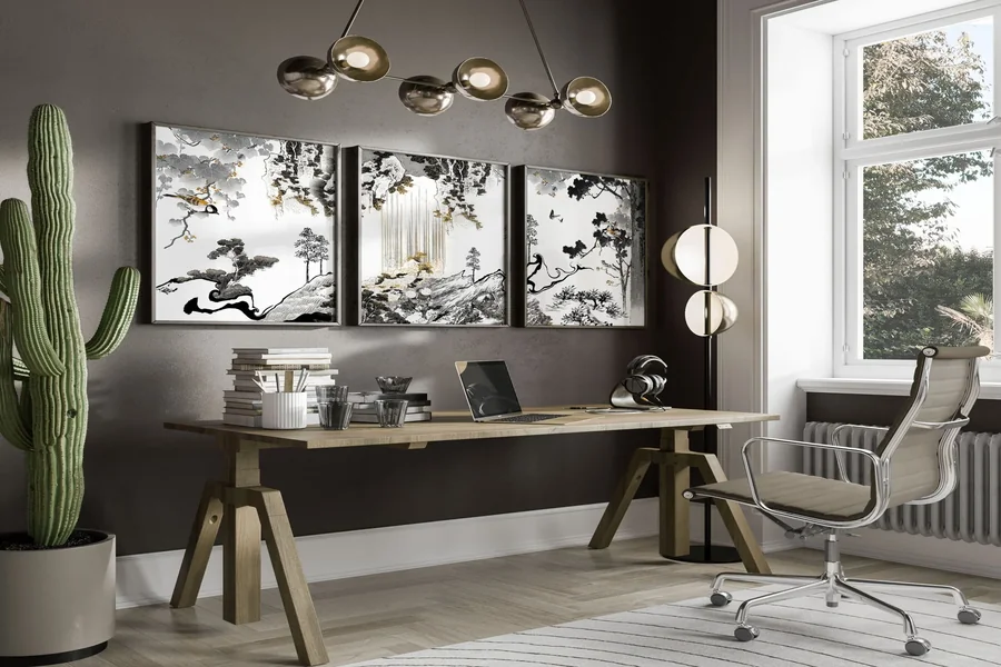
Office art isn’t decoration. Okay, maybe it is decorative. But that’s not all it is. Most offices approach art the way they approach all wholesale interior products, as items to fill space. The result is forgettable prints of bridges or abstract swirls that nobody notices.
Art in offices does more than cover blank walls. It sets the tone, influences the mood, and signals what kind of workplace this is. Generic choices create generic environments; thoughtful choices create spaces people remember.
Size Dictates Impact
Small prints scattered across large walls disappear. They look tentative, like someone wasn’t sure they were allowed to make a statement. Undersized art makes spaces feel unfinished.
Small art also causes another problem: clutter. Imagine a sideboard along a wall in the office. You purchase a beautiful vase and place it in the center. But something about it looks off, so you add a frame. It’s still not right, so you add a candle and something floral. Pretty soon, in order to get the scale you need, you’ve cluttered up the space with a bunch of stuff. It’s far more effective – and pleasant – to choose items that have the right scale.
Scale needs to match the space and the viewing distance. A piece that works beautifully in a private office becomes invisible in a conference room where people sit fifteen feet away. Large-format pieces command attention and fill visual space appropriately. Multiple smaller pieces work if they’re arranged as a cohesive gallery wall (making them effectively one) rather than randomly spread around.
Entryways and reception areas demand presence. This is where art first makes an impression. Go bigger than feels comfortable. Art that surprises creates more positive impact than art that politely fades into the background.
Color Carries Emotional Weight
Neutral offices benefit from art with color intensity. Blues and greens calm without sedating. Warm tones, reds, oranges, yellows, energize but can overwhelm in large doses. Consider what emotional state you want to encourage in different spaces and select art accordingly.
Break rooms and collaboration areas can handle bold, saturated color. Private offices where people spend hours concentrating need less visual stimulation. Conference rooms depend on their purpose: client-facing rooms project professionalism, while internal brainstorming spaces can be more adventurous.
Avoid matching art to paint colors exactly. That creates visual monotony. Art should complement the space without disappearing into it.
Subject Matter Creates Connection…or Distance
Abstract work sidesteps interpretation issues, but can feel safe to the point of sterility. Three orange strips on a white background? Definitely generic and sterile. Representational art, landscapes, cityscapes, and still life give people something to connect with, but carry the risk of cliché. Can you say hotel room?
An effective middle ground is to go local. Local artists and local subjects create an authentic connection to the place. Photography or drawings of your actual city, or generic skyline stock images. And local art solves both the problems mentioned previously; it feels neither sterile nor cliché.
Avoid art with heavy symbolism or contentious subjects in shared spaces. What reads as thought-provoking to one person feels hostile to another. Private offices allow more personal expression, but common areas really require broader appeal.
Framing Affects Perceived Value
Art doesn’t need museum-quality framing, but it does need frames that look intentional. Cheap frames broadcast just that: cheap.
Matting creates visual breathing room around pieces and adds refinement. Skip it on very large prints where the image fills the frame edge to edge, but use it on smaller works to prevent them from looking cramped.
A consistent framing style across a space creates cohesion. All black frames, all natural wood, all metal, wide mattes, pick a direction and stick with it.
Wall Versus Tabletop
Wall art dominates visual attention. Tabletop pieces, sculptures, art books, and small framed works provide texture at a more intimate scale.
In general, tabletop art needs to follow the same rules mentioned above – scale, color, and subject. But there are a few additional things to consider, including the following:
- Group in odd numbers when using multiple pieces. Three objects create visual interest; two look indecisive; five can start to feel cluttered.
- Vary height and form. A tall sculpture, a stack of art books, and a small framed photograph create dimension. Three identical items in a row can feel repetitive.
- Know your space. Reception desks need art substantial enough to read from a standing distance, not delicate pieces that guests have to lean in to notice. Conference room credenzas can handle bolder statement pieces that become conversation points before meetings start.
- Avoid anything fragile in high-traffic areas. Tabletop art in lobbies and common spaces takes accidental bumps. Save delicate work for private offices.
Adding Beauty is Never a Bad Idea
Your office space is a direct reflection of your business – who you are, what you value, and what you do. It is the first chance you get to communicate those things to anyone who walks in your door.
Art is a big communicator, so don’t waste your money on art that communicates blah. Take advantage of the thousands of options available and choose pieces that create connection and mood. Pull your customers and guests in the moment they walk in the door.
Adding beauty to any space is never a bad idea. It’s something people will enjoy and remember. And that means it’s money well-spent.
